What is a banner image and how can it be used for articles and homepages
Learn about banner images and how they can be used for articles and homepages.
Both Page Assets and Article entries in dotCMS have a Banner Image field that allows for a large Banner Image to be placed in the background on the upper part of the page.
Ideally, dotCMS should be provided with an image that is 4000 x 1300 pixels. If that’s not possible, a 40:13 aspect ratio image at the largest available pixel size may be used instead. The system will resize the image provided to 4000 pixels wide, crop it to 4000 x 1300 pixels, and then reduce the image quality to 70% before displaying.
The image will be displayed under a black(#000) filter at 50% opacity in order to darken it enough to display white text on top while still complying with MSU’s accessibility rules for text contrast. On an article, the Title and Summary will be displayed on top. On a homepage, the Summary and Banner Buttons will be displayed.![Screenshot_2020-11-20 Partnership between MSU, Sault Tribe encourages tribe members to consider pursuing natural resources [...]](/anrcom/uploads/images/Screenshot_2020-11-20 Partnership.jpg?language_id=1)
If an Article has been shared into the Banner container on a homepage to override the Page Asset’s existing banner image, the resulting banner will display similarly to an Article detail page, with the addition of a Read More button. The title and button will link to an anchor link on the Article detail page that’s below the Article’s own banner, to avoid confusion when the visitor clicks between two pages with very similar banner images.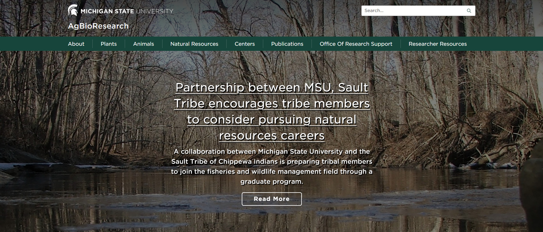
The Banner Image is intended for use as a background image only, and has no alternate text field. This means it cannot be used to convey information, as it’s not screen-readable.
The same Banner Image will be used regardless of the aspect ratio of the viewport (i.e., device size). Because we do not want to squish the image to do this, it will crop itself to present as different aspect ratios as required. The image is always positioned centered and with the top edge anchored in order to mitigate the consequences of this as much as possible.

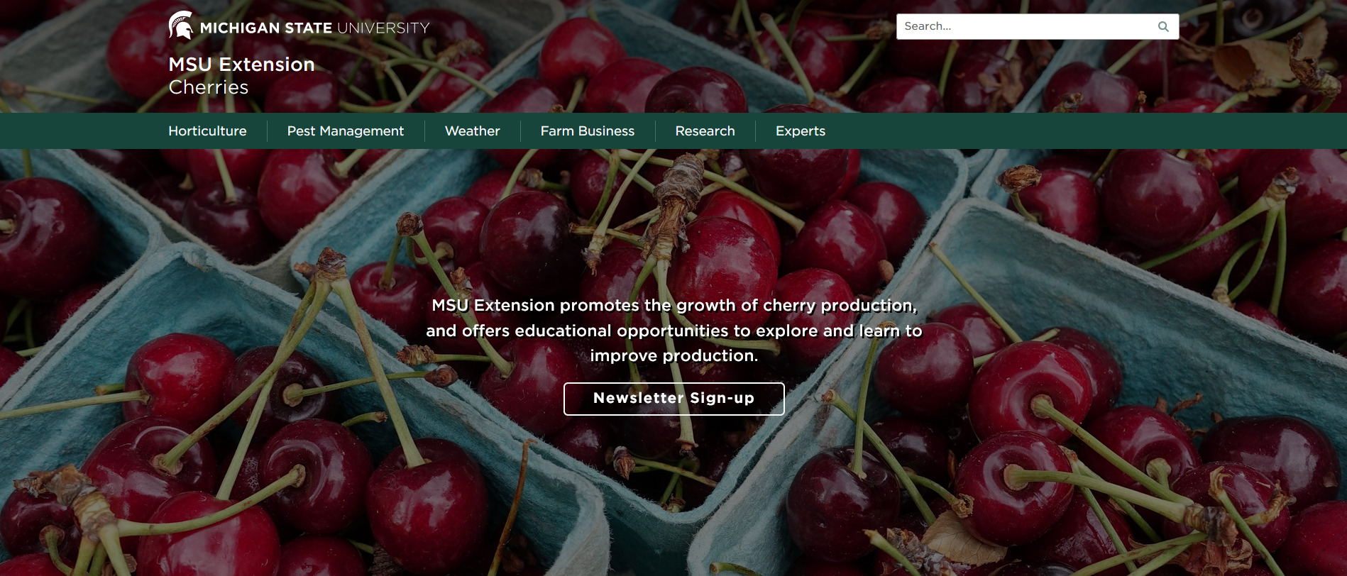
As a result of all of these factors, care should be used when selecting Banner Images. For accessibility reasons, the image should not attempt to convey information or contain a subject (especially a person). For viewport reasons, the image should be a “flavor image” that will be suitable even if it has been cropped to a significant degree. Banners should be tested on mobile devices and desktop browsers after they’re uploaded.


 Print
Print Email
Email