MSU Extension Brand Standards Toolkit
The MSU brand is a distinctive and memorable representation of the organization that:
- Announces our presence
- Builds the credibility of our programming with audiences and partner organizations
- Reinforces the sense of trust and loyalty that audiences have for our programming
Using the appropriate wordmark and other brand elements consistently on programming and promotional materials, apparel, signs and elsewhere, helps us to positively shape the way our clients, stakeholders and partner organizations think and feel about the MSU College of Agriculture & Natural Resources, MSU Extension and MSU AgBioResearch.
This toolkit is designed to guide you in following the MSU brand standards so that our audiences are exposed to a consistent message whenever they encounter or interact with our college, MSU Extension and MSU AgBioResearch. The toolkit draws from the MSU Brand (http://brand.msu.edu) website. The site was developed and is maintained by University Communications, the university’s central communications unit.
What Is [a] Brand?
“A brand is not a logo, tagline, colors, TV commercials, or websites.
“A brand is perception. More specifically, it’s the sum total of people’s perceptions and experiences—what they think, feel, and respond to when they interact with or see words or imagery representing Michigan State University Extension. And branding is the intentional process of shaping that perception.”
Click the following link to view the brand strategy from the MSU Brand website: https://brand.msu.edu/strategy.
Brand Elements
This toolkit is designed to explain how to use the various elements of the MSU brand – the wordmark, Spartan helmet, color palette, typography (typefaces), key messages, and tagline – on various print pieces (such as brochures, fliers, and educational and promotional materials), business cards, email signatures, web pages and other online materials, signs, apparel, and more.
Wordmark
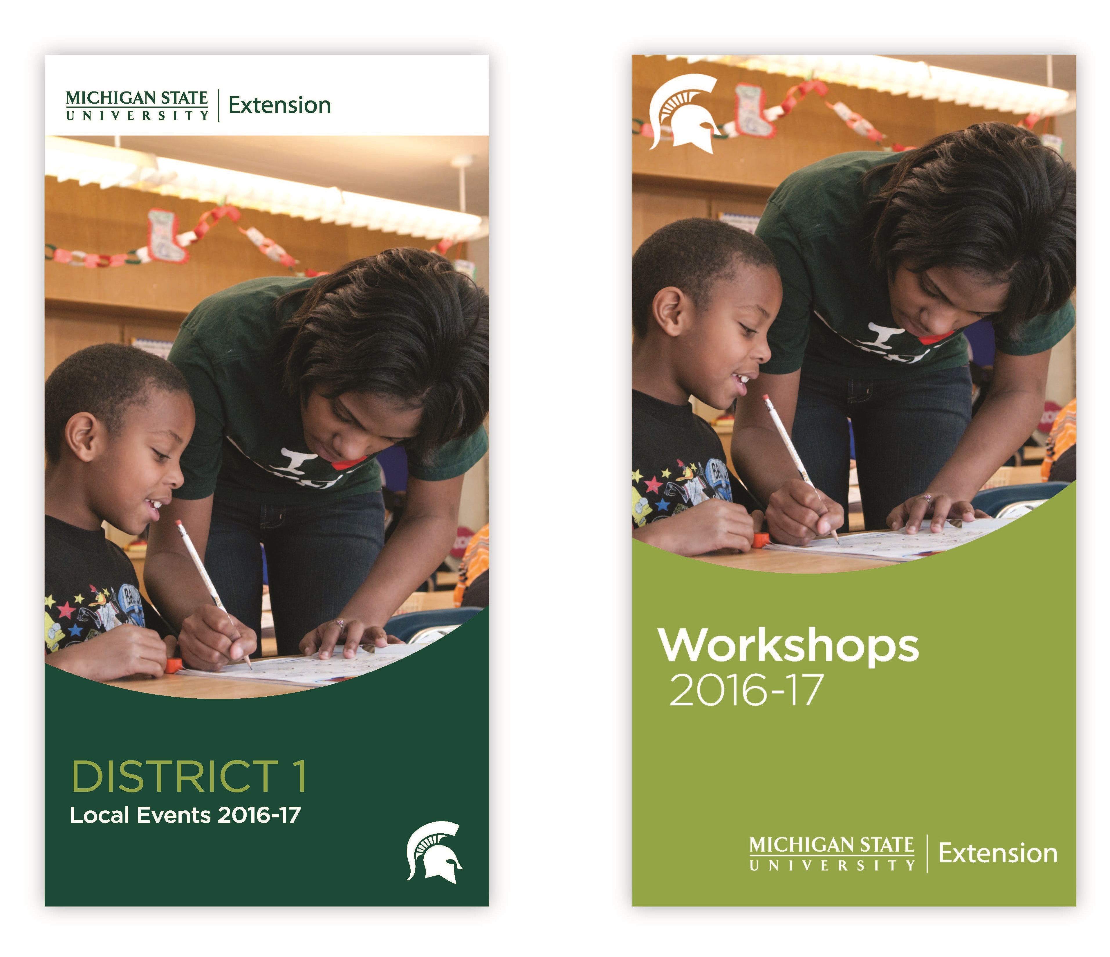
University Communications has approved the official MSU Extension wordmark (see Figure 1) for use on educational and promotional materials, signs, and more, but not for use on apparel. (See “On Apparel” for information on the approved graphic for use on apparel.). You can find all wordmarks for MSU College of Agriculture and Natural Resources, MSU Extension, MSU AgbioResearch, Project GREEEN and 4-H on our Wordmarks & Logos page.

Figure 1: Use the official MSU Extension wordmark on educational and promotional materials, signs, and more, but not on apparel.
Spartan Helmet
The Spartan helmet (see Figure 2) can be used on printed materials with or without a wordmark. The two elements may not be used so closely together (either side-by-side or above-below) that they appear to be joined, however. The helmet can also be used on apparel and signs (see the appropriate sections of this toolkit for guidance on those uses).

Figure 2: The Spartan helmet can be used with or without a wordmark on printed materials, but must not be placed side-by-side with or so closely above or below the wordmark that the two elements appear to be joined. The helmet can also be used on apparel and on signs.
Color Palette
Primary Palette
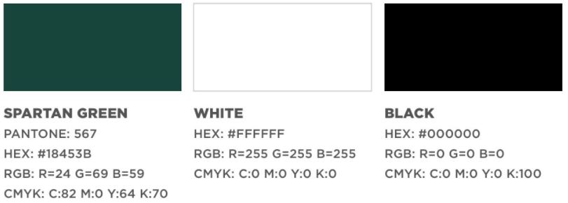
MSU’s official school brand colors are green (see Figure 3) and white. (For accessibility and for black and white applications, black may be used.) Different applications and systems use different formulas to create the proper green for print, web, and other uses.

Core Colors
- Pantone Matching System (PMS) color 567 – Mostly used by commercial printers.
- CMYK: C=82, M=0, Y=64, K=70 – Used in four- or full-color commercial printing.
- RGB: R=24, G=69, B=59 – Used in electronic documents, such as Word and PDF files.
- Hex (web): 18453B – Used in web design.
Figure 3: The official MSU green and white colors and the formulas for creating it for various systems. The black color may be used for accessibility and black and white applications.
Accent Colors
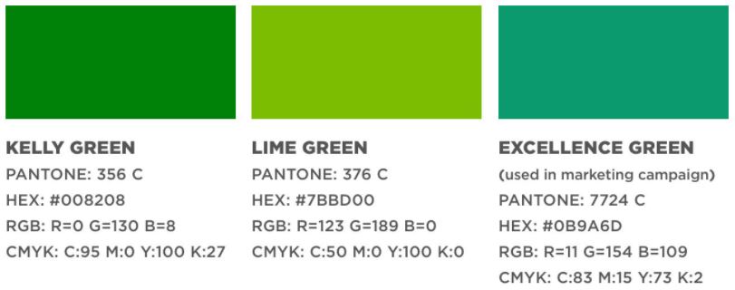
The colors shown in the accent palette (see Figure 4) consist of a family of greens. These accent colors, along with the primary colors, expand design flexibility, ensures accessibility, and builds immediate recognition, connection and greater consistency in communications. See additional details on MSU color pallets here at Color Palette | Michigan State University (msu.edu). The formula for creating each color in various systems appears below it.
Figure 4: The accent colors.
Typefaces
The primary typeface is Metropolis. As of August 2024, Metropolis (sans serif) is the primary brand font for MSU. This is an open font so you can download here at the Typography | MSU Brand Studio | Michigan State University.
The Secondary typeface is Liberator (sans serif) and is an all-uppercase font recommended for use in headlines for advertising, billboards and other display-type content. It should not be used for body copy or websites.
You may substitute Arial (sans serif), Helvetica (sans serif) and Times New Roman (serif) when creating documents or presentations intended to be shared in their native file formats (i.e., not designed and saved as PDF documents). See more here from the Typography | MSU Brand Studio | Michigan State University.
Key Messages
When writing articles, web pages, brochures, fliers, and other materials, keep in mind these MSU Extension Shared Values:
-
Our People Are...
- Trustworthy and authentic.
- Welcoming and respectful.
-
Our Work is ...
- Creative and innovative.
- Transparent and accountable.
-
Our Processes Are...
- Research and evidence based.
- Collaborative and inclusive.


 Print
Print Email
Email